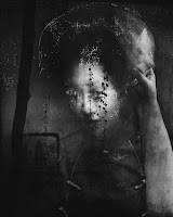
- First of all, they said the man was pushed into the way of the train and was unable to hoist himself onto the platform into safety. Then, the photographer said he tried to help Suk Han but failed in attempt. Next, the photographer said that he used his camera flash to try and signal the train to stop, which failed. Lastly, he said his photos were a last resort and he wanted to capture this tragic event.
- The photographer said “I just started running, running, hoping that the driver could see my flash,” and ended up capturing that photo in the moment it was happening.
- Honestly, I'm glad that he ended up taking the photo because it is a good way to show how violent the world really is, and I think that it is a good way to see current events in New York and even other places, for that matter.
- Even though I am glad he took the photo I would rather have seen a cover that said something like "man saves man from getting killed by subway" than what was actually presented to the public. I think the photographer should have spent a lot more time truing to lift Han up to the platforms than try and fail just so he can take an unnecessary image.
- I think that it was a good decision even though the photographer has to put up with the public for his actions. I think that people should realize that a little thing like shoving somebody can lead to a much bigger thing, like being killed. This photo shows that in a way.
- I think that capturing images of what is happening in life is more important because we can keep records of what happens, otherwise it just turns into some story that not everyone can believe. Capture it first, then stop it from happening.
- It really depends on the situation. If it is life-depending then hey probably should but if it isn't that important, why should they? If they don't want to have a bad appearance to them then I think they should help, but if they don't care what they get thrown at them then its their decision to help or not.
- They don't always have to stay out of things. If they feel that it is important enough to get involved, they should.
- "Because an iphone isn't designed to take photographs in the same way - the guy is a freelancer - he's probably using a DSLR. The photo above is super noisy so it's obviously a very high ISO and he's using flash - which means the guy was probably shooting at a fast shutter speed too - all of those 3 combined it's quite hard to get a blurry image.- I'm happy to believe the guy was running towards the train - but we live in a society nowadays where no one believes anyone even when they're telling the truth - also, I don't know how fast those trains come into the station but if that were a train here in London at this distance - no one would stand a chance of rescuing the guy because the trains come in far too quickly,"I think that this is the most appropriate comment because the guy actually believes the photographer and that is all a real possibility to what really happened.
Friday, December 18, 2015
Fall Final extra credit
Friday, December 11, 2015
Review for the Final
Kenya was in a state of war with their neighboring country, Uganda, until this unfortunate incident happened with Indeo Nahale stuck in the middle of a cop chase.
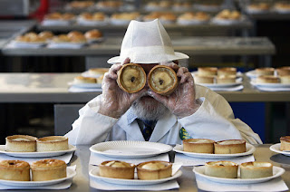
On May 4, 1979, Galven Avery was in his bakery when he saw a little child walk into the bakery so he wanted to make a good impression so he put his pastries up to his eyes, to be silly.
Mr. Avery has owned his store for over 25 years and this was the first time anyone had ever seen him be as childish as he was that day.
2.
1. Rule of thirds- a rule of thirds is when the photographer uses the grid on the camera screen to position the subjects on the corners of that grid.
2. Balancing Elements- this is where the photographer makes sure there are equal amounts of the subject in the photo so they don't look like there unbalanced.
3. Leading Lines- this is where the photographer uses lines to direct the viewer's eye to the subject.
4. Symmetry and Patterns (repetition)- this is when there is a repeated theme throughout the photo, or where there is an equal amount of the same thing on one side of the image.
5. Viewpoint- viewpoint is the angle that the photographer is looking at the subject when they take the picture.
6. Background- Using different backgrounds in the image can hide or bring out the effectiveness of the subject.
7. Create depth- this is when the photographer sets the photo up so that it gives a sense of 3 dimensions and not just 2.
8. Framing- this is when the subject is framed by something that they are being surrounded by in their location.
9. Cropping- Is when you get closer to the subject so that there is less background to disrupt the subject.
10. Mergers and avoiding them- a merger is when the photograph has a person or thing that is partially cut out and we try to avoid these because it is not appealing to look at.
3.
- aperture is the size of the opening of the lens in the camera limiting the amount of light that can get in at any time.
- Shutter speed is how fast the shutter closes which also limits the amount of light that can come in. The slower the speed, the larger amount of light received.
- ISO is the sensitivity to light that the camera experiences. The lower the number, the less sensitive it is to light.
4.
Changing a person's face and body in any way aren't right, but cropping and adding light exposure are okay.
5.
- An environmental portrait is where the subject is in a good place that resembles who they are or what they do.
- A formal portrait is where the subject is dressed nicely and is looking directly at the camera.
- an informal portrait is where the subject is not looking at the camera and is doing something else.
Wednesday, December 9, 2015
extra credit websites
http://petapixel.com/2014/12/19/disorienting-beauty-spiral-staircases-old-abandoned-buildings/
Spiral Staircases:
A photographer by the name of Christian Richter has been taking pictures of abandoned buildings in Germany. He travels around cities exploring new buildings until he finds a cool staircase and then he photographs. Most of his work makes a disoriented feeling that can even make you dizzy.
I really liked this photo because the staircase doesn't look very run-down and then the spiral goes all the way into the distance making the picture feel 3-D.
There aren't many rules of photography but there is a simplicity and depth.
Christian Richter took this photo.
Great Portraits:
Magazine Covers: Part 2
Early Magazine Covers:
The earlier versions of were modeled off of book covers. They had a title, an image and publishers and others names. More and more symbolic and generic magazine covers began appearing and then they started to add cover lines to the covers and many different images trying to express different things in the same cover page.
The Poster Cover:
Most cover posters began appearing in the early to late 1800's. They do not feature any cover lines or themes on the cover. They also show more of the photograph than most covers. They feature large photos or artworks on the front cover that would catch people's eye: these could substitute for more cover lines. Poster covers are for primarily showing off the photograph that is in the cover and not the cover lines and themes as much or if at all.
Pictures Married to Type:
Most magazine cover had to rely on their cover lines to give information about the magazine, but then the integrated covers began to appear. These newer covers featured the art and the cover lines and text that a magazine usually has. These are what mainly makes the difference between an integrated magazine and a regular cover,a large title with the models face overlapping it, a model in a (nearly) full body pose,a model in an unusual and expressive posture,cover lines on all sides of her, carefully positioned in relation to the model and the background.
In the Forest of Words:
Cover lines were very important for making a good type of covers. When the cover lines and the art blended together in harmony made for a strong appeal in the covers. In all of the magazines that use a forest of words there are many cover lines and words that cover up the whole image taking away from the images' effect but giving more insight about the magazine. All of these type of covers have a n image on it but there are parts, which could be the most important part, are covered up.
Thursday, December 3, 2015
Fashion Photography Evolution
1. The model looked completely different from when she started to where they finished. The photo editor changed the length of her neck, he adjusted her hair, he made her eyes and eyebrows relocate on her face, he made her lips larger and then he made her eyes bigger.
2. On this model, they changed her hair and make-up, but then they changed how high her shoulders were, they made her legs longer and her feet shorter, they reformed her eyes, then the editors moved her hands out making her arms longer and then they completely changed her whole skin tone.
3. The photo editors completely changed this woman. At the beginning she was bigger in all her features. Then as they went on they changed her calf muscles to make them look smaller. Then they changed her upper legs; they made them smaller in size! Next they changed her waist and her hand. Later they changed her gentiles and her torso. Next the editors changed her entire face and added a lot of hair to the existing hair. Finally, they smoothed out the rough edges and gave her more visible features.
4. I do not think that this is ethnically acceptable to change people like this. I think that the only thing that should be changed on a person is the amount of make-up they are wearing, which still compromises their real appearance. Photoshop should not be used to make a person look better. What they look like is what they look like and you shouldn't change that, and sure it might look better if you do photoshop them but it isn't right, so you shouldn't do it.
5. Yes, in every way changing a persons' appearance is not right. There shouldn't be any cases where this is actually ethnically right.
6. I think that there are way more changes that can be made that aren't good and there are only a few that are OK. I think that the use of make-up is alright and I also think changing patches on the model that don't want to be seen are not seen . I think that changing facial features are wrong, moving body parts around to fit a certain look isn't right, and changing a persons natural body shape isn't right either.
7. First, I think that changing an image of a plant or non-living thing in photoshop to bring out colors or something else is alright. With fashion photography using photoshop is wrong if you change that persons appearance. I also believe that you can write a caption to go with the image and with fashion photography you are just showing off people or clothing designs or something else, and it tells its on story.
8. I think that photojournalism shows what you can do and see in the world, and fashion photography is more of showing what is happening in the designer world. Photojournalism is more practiced by upcoming or famous documenters and fashion photography is practiced more by people who want to show the world the beauty of people.
9. I think that you are showing us these videos to show what is actually happening in the world of photography to expose us to the use of photoshop and how it is right or wrong.
10. I think that none of those videos were about guys because it is easier to change how a woman looks than it is to change a man. The women also care more about their personal appearance than men do so they let people do it to them more.
My favorite cover
"For our August 2014 issue, FamilyFun commissioned photographer Sabrina Helas to shoot our cover story on family road trips. The minute we saw this image in the film, we knew we had our cover. Shot at The Corner Store in San Pedro, CA, the photo is filled with the kind of joyful, authentic details we love — the vintage blue bottle, the candy bracelet, the world's best burger, and a side-glancing smile of delight from 6-year-old Isaac. Intriguing and spontaneous-feeling, it sums up what our brand is all about: making happy memories with your kids."
- See more at: http://www.magazine.org/asme/magazine-cover-contest/past-winners-finalists/2015-winners-finalists#sthash.uGZXpnCI.dpufMy Critique: I thought that this was a good photo. I see mainly just the boy in the image, showing that the photographer had a simplicity going. The exposure in this image was really well prepared, because the photographer used the natural lighting from the outside to light up little Isaac's face. The image also goes along with the topic of the magazine article because he looks like he's having lots of fun and a family road trip, where he is in a corner store having their famous burgers and an authentic blue soda bottle. I think the image could be a little stronger if there was another person he could be smiling and laughing with. Having only Isaac in the picture does bring happiness but I think it can also make a family trip have less of a feeling of a fun, family event.
Best Covers
- formal
- formal
- informal
- informal environmental
- formal
- informal
- informal
- formal environmental
- informal
- informal environmental
- formal
- informal
- formal
- informal
- informal
- formal
- formal
- informal
Tuesday, December 1, 2015
Magazine Covers: Part 1
- You need the cover to have all of the same color scheme to give a better affect to the magazine and make more people look at it; a visual appeal.
- You can use as many types of cover designs as you can fit into that one page ,which will bring a different, unique visual that other magazines don't have; this brings variety.
- Coverlines are also very important. If a costumer can't see what is on the inside of the magazine they won't buy it, but with cover lines they can get a hint of what they'll be reading.
- Make it appealing to a certain type of viewer, so more of them buy the product.
- Make the magazine an easy to read, easy to follow investment that people will enjoy to look and talk about. That might just get more purchases of the magazine.
Monday, November 16, 2015
American Soldier
A. I think that image #28 is the most powerful because it tells you that he returned to his
girl -friend and his family and the image gives a hint of that emotion that they can feel just from the image.
B. Set 1 - at home - Image #1 to Image #4
Set 2 - basic training - Image #5 to Image #15
Set 3 - in Iraq - Image #16 to Image #27
In Image #28 he is back at home in Denver
C. I think that set 2, basic training, was the most powerful because it was the part of the army that taught him everything he knew, and that is what helped him do well in the action of Iraq.
D.The images work well together to tell a story because they show many different times in his life and it showed how Ian changed and developed during each different time and place.
E.It was written in mostly paste tense.
F. The captions enhance the images because they make the story behind each image show a little more by having just a little insight to what was happening at that time.
G. Ian Fisher wanted to become an American Soldier in Iraq. He spent many weeks in training for the trip to Iraq. Then he finally gets to go where he wanted and he comes back from it a changed man. The war had mad him think and look in different ways, he is also damaged so that he has to take drugs to make him feel better. When he gets home he has wishes to become a husband and a father.
Thursday, November 12, 2015
Portraits and Self- Portraits Part 1
Part 1:
Shoot Candidly-Sometimes posed shots can look somewhat…. posed.Some people don’t look good in a posed environment and so switching to a candid type approach can work.
Introduce Movement- Portraits can be so static – but what if you added some movement into them? This can be achieved in a few ways:by making your subject move, by keeping your subject still but having an element in the scene around them move, and by moving your camera (or it’s lens to achieve a zoom burst).
Use your imagination- A self-portrait can reveal a lot about you, by including props and even other people that are meaningful in your life.
Environmental Portraits:
I posted this because I felt that the environment had an affect on the image. It tells the viewer that the girl likes to be out in the open country because of her environment and what she was wearing.
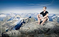 In this image the photographer got the man on the top of a mountain or hill and shows the background landscape which allows the viewer to infer that the man likes to hike.
Self- Portraits
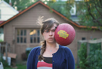 I thought that this was a good portrait because it captured emotions that happens quickly, in one still image and it has a feel to whats going to happen next
This image has the subject looking off center which adds to the mans nature and emotions.
Casual Portraits
I liked this image because the subject is doing what it would normally do and he looks like he's having fun so this is a portrait that shows his everyday life.
In this image the woman looks very happy and the lighting also makes the background look alive, making the portrait have a feel of happiness.
my plans:
I plan on taking images of myself and my brother doing what we would normally do at home or any other place and I would want to make the environment look very happy and cheerful as a reflection of our emotions; it would also be cool if I could get a very different kind of background every time so nothing looks the same. I will get the most noticeable rules in the portraits and then I will use portrait tips that can add even more enjoyment to the portraits.
Love and Losses
Warm-Up: Love and Losses
- The first few photos made me feel a great deal of happiness, and love, but as the images kept going I started getting a sense of sicknesses and loneliness, which eventually led to greater more upsetting things.
- I think that the quote does a good job of saying that even though theses picture are us they don't make up who you are and you can do something about it if you want to.
- I would most likely be able to take a series of images like these but they wouldn't tell such a big, deep story. My images wouldn't be as touching and as life-like as his were, but I might be able to tell a story with them.
- If I had to write Angelo a letter I would probably tell him that he did a great job on his images and that I felt sorry for his losses and I understand what he's doing in his work.
Friday, October 30, 2015
Abandoned theme parks
Nara Dreamland, Nara, Japan
I want to visit this amusement park because it is something that is a copy of an American park, Disneyland. I think that it would be quite amazing to see a park that is in another country and is made because they admired the American works. I would want to see what was the same and what is different in both parks. Nara Dreamland could feature more things than Disney land, it could have Japanese characters in it while Disney land is all Disney characters. Disney land seems like a great place; I've never been so I don't actually know, but I still think that seeing an American park in another country would be picture worthy.
I think that the insides of caves would be cool. Another would be underwater. One could be from way up in the trees looking down. the fourth might be unpopulated desert plains and hills. Lastly I think that it would be cool from a spacial view of earth.
I think that it would be cool to take pictures inside caves because there are so many things that can happen in them I think it would be fun. There is also a slight adventure that could go with these images because you'd have to explore the cave and then take a picture. If I were taking pictures of caves i would come out with images of the natural things that are in that cave such as bats, or stalactites and stalagmites.
If I was going to a cave I'd need to have the transportation to get there, if the caves in the city or not. Then I would need rock climbing equipment( a harness, cables, gloves etc...) and a camera. There could also be a price to get into that cave.
Wednesday, October 28, 2015
Africa
Africa:
My overall reaction to his work is that I think that it really great that there are people out there who want to help Africa's native animals. I'm glad that he took these photos to show what the animals do in their "State of Being". His images didn't only capture what the animals did in their environment but it showed how they did it and he made them look amazing. In all of his photographs he managed to get the animals at great times, so the images had a contest of the land to the animals making them stick out.
This is my favorite image that Nick Brandt took. It is capturing two zebras looking back at something. I like this photo the most because he made the zebras stick out and had the white very vivid in color. The image has balance because both of the zebras create a level in the image, leading lines on the zebras and simplicity because the zebras are the only interesting thing in the image.
Nick Brandt uses a medium-format black and white film and he also does not use any telephoto or zoom lenses. He doesn't use these lenses because he wants to get as close to his subject as possible without disturbing them.
He wants to bring awareness to people about the endangerment of African animals. His hope is to get the local people or tourists to donate to the charities that help theses animals have better lives.
"Africa is Africa because of the animals there.The elephants, lions, giraffes, cheetah, rhinos- they are all iconic creatures that exert a powerful, deep emotion and mythical hold over our imaginations. But we can no longer take their presence for granted. At the current rate of destruction, by the next generation, they will be gone."
-Nick Brandt, August 2013
Monday, October 26, 2015
Funny Captions
Friday, October 16, 2015
Great Black and White Photographers: Part 3
- When I was looking at my photographers images, I noticed how he took many photos of the same thing with a different visibility. He made many pictures that overlapped each other and that you could see had a past- present theme, for example a building that was once there is now gone but is still visible because of his images.
- In the second picture here, I see a tree inside the form of a house, but both objects are visible here. I smell the tree pollen that is all around the house, I can hear the birds and other animals calling out to the world. Then I can feel how the house is there but not there, its almost tangible but it's not.
- In the last image, Laughlin made one image out of three. The girl's face makes me feel alone inside. I see her face, the swamp-ish area in the background and the stars overhead. The image doesn't give a smell or a taste but there is little or no sound, if there is it would be an eerie screeching.
- I think I would use a blog to expose my photographers images because anybody can view your blog, but with a poster or powerpoint would only work for a group and not a town or city.
Mural Project: Introduction
- I think that the athletics would create a good theme that we can take for the panels around the school. There are so many different activities that this school does, it would be easy to find an activity to make a mural of.
- I think we should use all types of cameras, if its phones or actual cameras because they could get different kind of images, than if we just used one type of camera.
- I would either put the mural somewhere in the courtyard because everybody sees it sometime in the day and it would be viewed easiest. I also believe that we could put it in the front entrance of the school outside the office.
Thursday, October 8, 2015
Academic post Shoot reflection and peer review
- A challenge for me was deciding which rooms to enter because I didn't want to be denied access to take photos of a classroom.
- I found myself trying to get as many rules as I could in one image, I also wanted to get a picture that told the best story or had the most going on in it.
- If I could do the assignment again I would take way more images of anything I could. I would use as many unique angles and viewpoints as I could.
- I think I would have kept my camera settings the same as they were because the images turned out pretty well.
- Next prompt the rule of thirds will be the easiest to achieve because I know how to get to it because all you ever need to do is turn on the grid in the camera and you can position the subject as you need.
- I think the hardest rule to capture might be balance because there has to be more than one thing that you can actually take a picture of so that they balance each other out.
- I'm not to clear on balance still but I know that there are some websites that can tell me everything I need to know and the Bowie blog has it on there as well.
- In every one of her photos she includes a nice subject and brings out the composition well.
- Adding more contrast would make the images even better!
Tuesday, October 6, 2015
Camera Simulator
Available Aperture: 2.8, 4, 5.6, 8, 11, 16, 22
Available Shutter Speed: From 1" to 1/4000 of a second.
Available ISO: 100 200 400 800 1600 3200 6400 12800 15600
Friday, October 2, 2015
The Three Pillars of Photography
ISO: An advantage of a higher iso at sporting events would be that your images would come out to be clearer than at a low ISO. The author said to use a slower shutter speed when there is plenty of light to get there best quality image. The author said to increase the ISO levels when there is little light available.
 |
| 3200 ISO |
 |
| 100 ISO |
Aperture: The aperture is closely related to the pupil. The smaller the aperture, there is less light coming in and the larger the aperture, there is more light coming in. Depth of field is where the foreground is in sharper focus than the background, so the background is blurry and the foregrounds are in focus.
This was taken with an f/2.8. The hand and the bird are in focus but the background isn't.
This was taken with a f/20. the thistle is in focus but the background is too.
Shutter Speed:
- A. medium
- B. Medium
- C. Fast
- D. Fast
- E. Fast
- F. Fast
- A. slow
- B. slow
- C. Medium
- D. Medium
- E. Medium
- F. Medium
Fast Shutter speed
Slow Shutter Speed
Wednesday, September 30, 2015
Part 3 of Interesting and Unusual Photos
- Capturing a smile that tells a story would make a picture more likable.
- A reflection can also make a photo look more dynamic.
- Have the subjects look like they are being affected by their environment, this will help your photo look better.
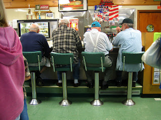
I think that this photographer copied the other's fairly well. I think this photo tells a pretty good story just like the original painting.
Part 1 of Interesting and Unusual Photos
- I liked his photos but I don't believe that they are real. they leave a erie feeling because of the ghostly figures that shouldn't be there but are there.
- I have to think they are photoshopped because there were too many landmarks overlapping each other.
- I think that the U.T. Tower in Austin would look good like this. It is a public place but it is downtown Austin which would be hard to get a photo of it because of location.
Monday, September 28, 2015
Academic Shoot
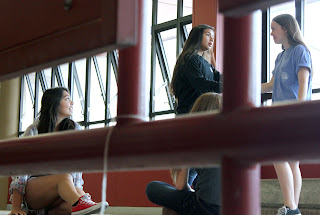 This is framing because the stair case railing covers the space surrounding the girls in the photo. The subjects are the two girls shaking hands, which you can't see because they are behind the railing.
This is a rule of thirds. Her head would be in the top left of the grid if it were there. The subject of this is the girl putting sticky notes on her book.
Subscribe to:
Comments (Atom)


